5 years ago, not all that long after I started shooting bands, I got the chance to go and shoot Killswitch Engage’s headline show at the 02 Academy in Glasgow. It was my first big show, and it was pretty intimidating, but I gave it my best shot.
At the time, I was more pleased with getting the opportunity than I was the photographs. Looking back…I’m not very stoked on that first set of images at all. For obvious reasons.
On the other hand, I’m now pretty pleased about how far I seem to have come since that show and I was stupidly excited to get the chance to shoot the band again. The fact it was also in the Barrowlands this time was an extra bonus. There isn’t a better venue anywhere.
So I thought it might be a cool exercise, or at least a way to waste my lunch break, to take a look at some photos I like, or don’t, from that first show and the one from last week and analyse my shooting and editing styles and how they’ve evolved. Or haven’t as the case may be.
Killswitch Engage | O2 Academy, Glasgow | 4.2.14
I still quite like this shot actually. Its got a lot of intensity to it. On the other hand, it’s not exactly sharp and clearly it was still in the days I dreaded red lights in a coloured edit. It’s a shame I didn’t seem to want to make any of the blacks actually…black. It really robs the image of a lot of the depth and atmosphere I’d be looking to put into it now.
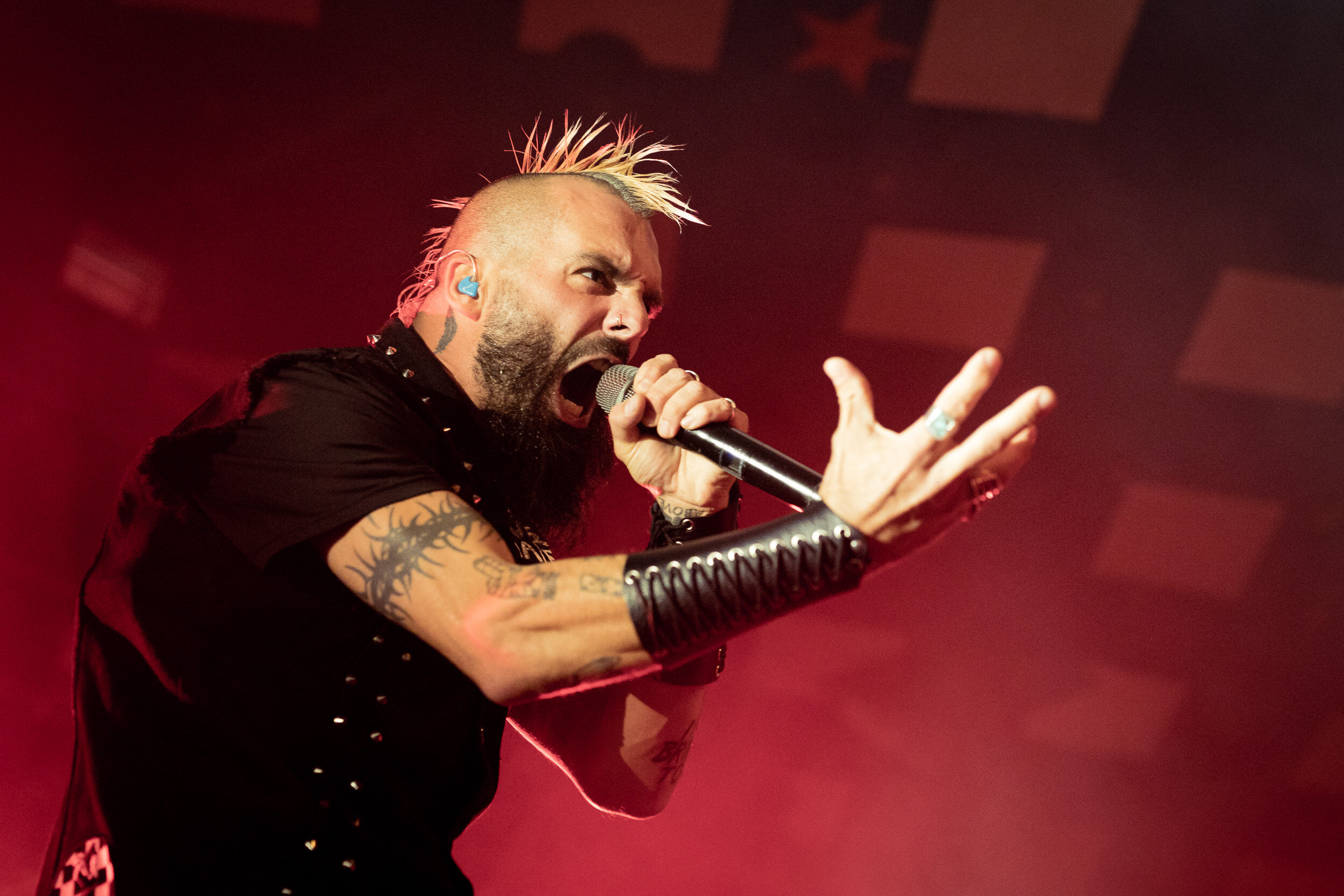
Killswitch Engage | Barrowlands Ballroom, Glasgow | 17.10.19
In contrast, I quite like red in images now. It’s not as daunting an obstacle as it once was now I’m at peace with the HSL panel in Lightroom. Or even using Lightroom. Those old images were still done on an iPad using Snapseed.
This one is obviously all about the pose, it works perfectly with the red lighting to invoke a real sense of drama and intensity to the image. It speaks volume to the quality of the Canon EOS R and Sigma’s Art series of lenses that they can deal with the amount of haze at shows like this to let me capture an image this sharp. And I’ve at least started to learn a little about composition as well which doesn’t hurt either.
Killswitch Engage | O2 Academy, Glasgow | 4.2.14
I didn’t have the best of gear back in the day, I believe this was all shot on a 50mm 1.8 and a 650D, and then cropped within an inch of it’s life, but I clearly had an issue using manual focus to compensate for the shortcomings of the autofocus. And my editing with colours and my feel for tones…also left a whole lot to be desired.
That said, I still like the composition of this image quite a lot. Moving subjects to the far side of the frame is something I find myself doing more and more. I enjoy the idea of empty space in my images for some reason. Because I’m empty inside maybe?
Killswitch Engage | Barrowlands Ballroom, Glasgow | 17.10.19
All that stuff about empty space being said…I also really like filling the frame and shooting through things a lot. I’m going through a phase of challenging myself to shoot exclusively at F2.0 to try and isolate my subjects create a sense of depth in my images. This an example of that working by keeping the face in focus and keeping the bass and ceiling nice and soft.
So many gig shots focus on scale, especially in larger venues. It’s understandable, but I still maintain the magic of live music is in people’s faces and their reactions. It’s nice to remember to get up close, even at the big shows.
Killswitch Engage | O2 Academy, Glasgow | 4.2.14
A bold attempt to go for something a bit more atmospheric. I like that edit on this. It is darker, and the blacks are actually black for once. But again, not in focus and to be honest it’s probably a split second too late, the posture indicates this is at just the wrong end of the movement. On top of that, the saturation in the colours makes the whole thing feel a little garish, and the noise is enhanced as a result.
Killswitch Engage | Barrowlands Ballroom, Glasgow | 17.10.19
In contrast, here’s a movement at just the right moment. I’m pleased with the composition as well. It feels dark and moody but has a sense of power because of the movement and there’s a nice sense of detail to the scene thanks to the Barrowland’s unusual roof. I typically try and avoid using my wide-angle 28mm lens too much at shows, because a lot of people default to wide for a sense of size, but it’s important to break it out to capture the full story now and then.
Killswitch Engage | O2 Academy, Glasgow | 4.2.14
I still really like this image actually. The limitation of my gear at the time lead to a lot of these angled shots, but it creates a bit of depth to the image having the two subjects in it and the movements are strong, dramatic and a bit of fun. Editing wise I don’t hate it either, but it’s not terribly sophisticated, and it does feel a little muddy. Unsurprisingly, not in focus. Yet again.
It’s amazing I make my living doing this now…
Killswitch Engage | Barrowlands Ballroom, Glasgow | 17.10.19
The rise of the vertical social format has been a good thing for my photography because it forces me to take portraits into consideration much more than I used to. The first time I shot Killswitch 5 years ago…not a single portrait image. This time around, I made a concerted effort to get a few.
I really like this one because it feels very dramatic, and it also allowed me to get both drummer and singer in the same shot. No mean feat, drummers are so often excluded from images because of their position and it’s a shame because the physicality of their instrument makes them great subjects.
Killswitch Engage | O2 Academy, Glasgow | 4.2.14
Case in point, here’s my one drummer image from the first time I shot the band. Weird angle, not in focus, nasty black and white processing…not a winner by any stretch of the imagination.
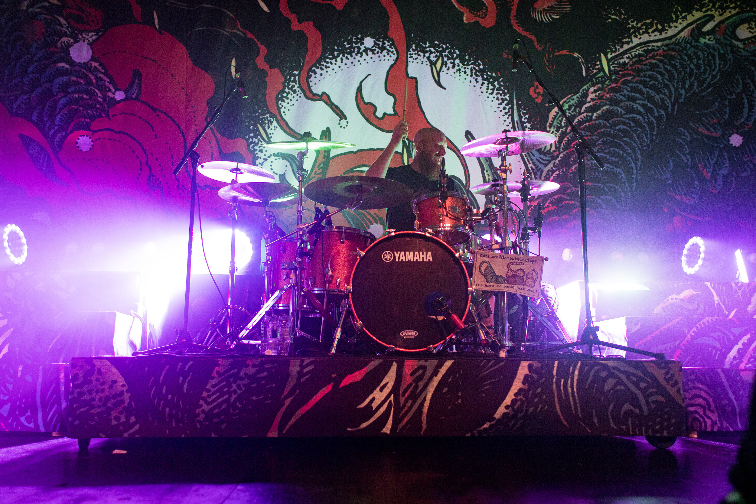
Killswitch Engage | Barrowlands Ballroom, Glasgow | 17.10.19
In contrast, here’s a drummer shot from last week’s show. More or less straight, in focused and considered composition in terms of where the subject is, their movement and the lighting. In an ideal world, I’d have had more time and control to get this exactly how I wanted, but for an on the fly shoot…I really like this one.
So what have I learned?
It’s important to get your images actually in focus
Editing is about less is more, it should feel like a photo before anyone notices an edit
I’ve finally figured out how black and white editing should work. Or at least, how it shouldn’t
Gear does make a difference, but good gear doesn’t immediately equate to good photography
Portrait orientation images are also cool
Kilslwitch Engage are still sick
Here’s a few more images from the show as well. If you’re into that kinda thing.


