To paraphrase Paul Valéry: "nothing is ever finished, only abandoned." This series of blogs is where I look back on some photos I took a while ago, re-edit them and compare and contrast the results. Hopefully it is a useful exercise in examining my own creative process and results in some progression to celebrate. Or at least some glaring mistakes to laugh at.
A couple of years ago, I was lucky enough to get the chance to photograph post-hardcore luminaries Thrice in London at a one off in-door UK date in support of their pretty spectacular comeback record "To Be Everywhere Is To Be Nowhere". Given my (almost) unconditional love for Thrice it was a pretty big milestone for me to a) get a chance to photograph them for a second time and b) be allowed to do it in super competitive London.
In retrospect, this wasn't my strongest set of photographs, but here's 6 from the set I still like with the original edits followed by some new approaches.
Edit 1: ISO 8000 | 16mm | f2.8 | 1/500
Edit 2: ISO 8000 | 16mm | f2.8 | 1/500
One of my old shooting tactics was to shoot the first of the three songs allowed with my ultra-wide lens because 'bands will always come out with a big bang, so try and get all the action'. Not true. But, because the band did open with the expansive and dynamic 'Hurricane' they did move about a bit, and I was helped by the wonderful low stage at the Kentish Town Forum to fill the frame.
Obviously, this image isn't 100% in focus (or even close to that), but I like that there is a sense of movement and scale to it and I prefer that to total focus. Colour wise, the original feels way too dark and contrasty. Though the slight green tones to the stage lights are nice, its like the light dies flat towards the edges of the frame.
In black and white though I think two things happen: firstly, the lack of light doesn't matter as much because low light and black and white are perfect companions for each other. Secondly, the darkness and contrast of black and white further enhance the kinetic feel of the photograph and lend it that vintage feel that only genuinely grainy black and whites can.
Also, I somehow feel the overblown highlights in the black and white pull you into the screaming face of Dustin more than the colour does, even though it doesn't do anything at all to enhance the detail.
Edit 1: ISO 4000 | 85mm | f1.8 | 1/400
Edit2: ISO 4000 | 85mm | f1.8 | 1/400
This photo is all about movement. Mostly I end up manually focusing at concerts because both cameras I've owned haven't had the greatest spread of focusing points (thanks Canon), so the fact I managed to get this so sharp at 1.8 feels like a pretty big achievement.
I actually don't have any major issues with the original photo. The dark blues into the corner and background are probably a bit too heavy and saturated vs the rest of the photo. The purple focus of the split toning as well washes out the rest of the photo a bit.
The second edit attempts to resolve this by adding a flash of green in the highlights and ramping the saturation on that while pulling a bit of tone and saturation out of the blues. I much prefer it, it feels much more like a film-esque grade than the previous one does. Though I concede, to most people this is probably a pretty subtle distinction.
Edit 1: ISO 6400 | 50mm | f2.5 | 1/400
Edit 2: ISO 6400 | 50mm | f2.5 | 1/400
For my money, the best photos of bands are the ones where lots of members are in frame and are interacting with each other or the audience. That's the real magic. Bands are a team, bands are a gang, and that means it isn't about one person. So this one with Dustin interacting with Riley (out of frame) and Ed ticks all the boxes. Plus, it has some pretty excellent motion across the two of them in frame. You can almost feel the movement caused by the music.
Much like the last image, there isn't a huge amount of change here. I warmed up the colours and changed the split toning to something that felt a bit grittier. The first image feels very cool and open, but there's a closeness evoked by deep blacks and warm colours that works better for live shots with lots going on like this. Again, this image needed the tones of the blues adjusted, the lights on the night just weren't quite what I wanted. I also re-exposed this and slid my curves around to expose Ed a bit more vs the previous version of the photo.
Overall, it's not a huge move from one image to the other. I'm pretty convinced the second approach works much better though.
Edit 1: ISO 6400 | 50mm | f2.5 | 1/250
Edit 2: ISO 6400 | 50mm | f2.5 | 1/250
Obviously there's a bit more distinction between these two versions. For whatever reason, when I first edited these images I drove the colour temperature right down, but now...I don't feel like it suits how this band sounds. That is to say warm, textured and earthy and not cold, spacious and detached.
The main difference here is in the split toning. Instead of a green tint, this time its a mix of green and oranges helping to bring the rich depth of the photo to life. Second time around I also crushed the blacks a touch more because crushing blacks is the best. I also blew out the highlights just a touch, which I feel always looks a lot more cinematic than trying to bring them back. Composition wise, I'm pretty stoked on this image, even with the Fire Exit sign illuminated in the background. Perfectionists would probably Photoshop that out, but I'm either too lazy or have too much integrity. Take your pick.
Also, notice how clean this image is even at 6400 on what even then was an old camera. People shouldn't be afraid to push their ISO. Noise and grain doesn't matter when the moment is there.
Edit 1: ISO 5000 | 50mm | f2.5 | 1/320
Edit 2: ISO 5000 | 50mm | f2.5 | 1/320
Again, not a huge difference between these images. But it seemed obvious as soon as I was looking at it again the image needed harder blacks, deeper shadows and warmer, richer colours. So that's what happened and I think it works much better.
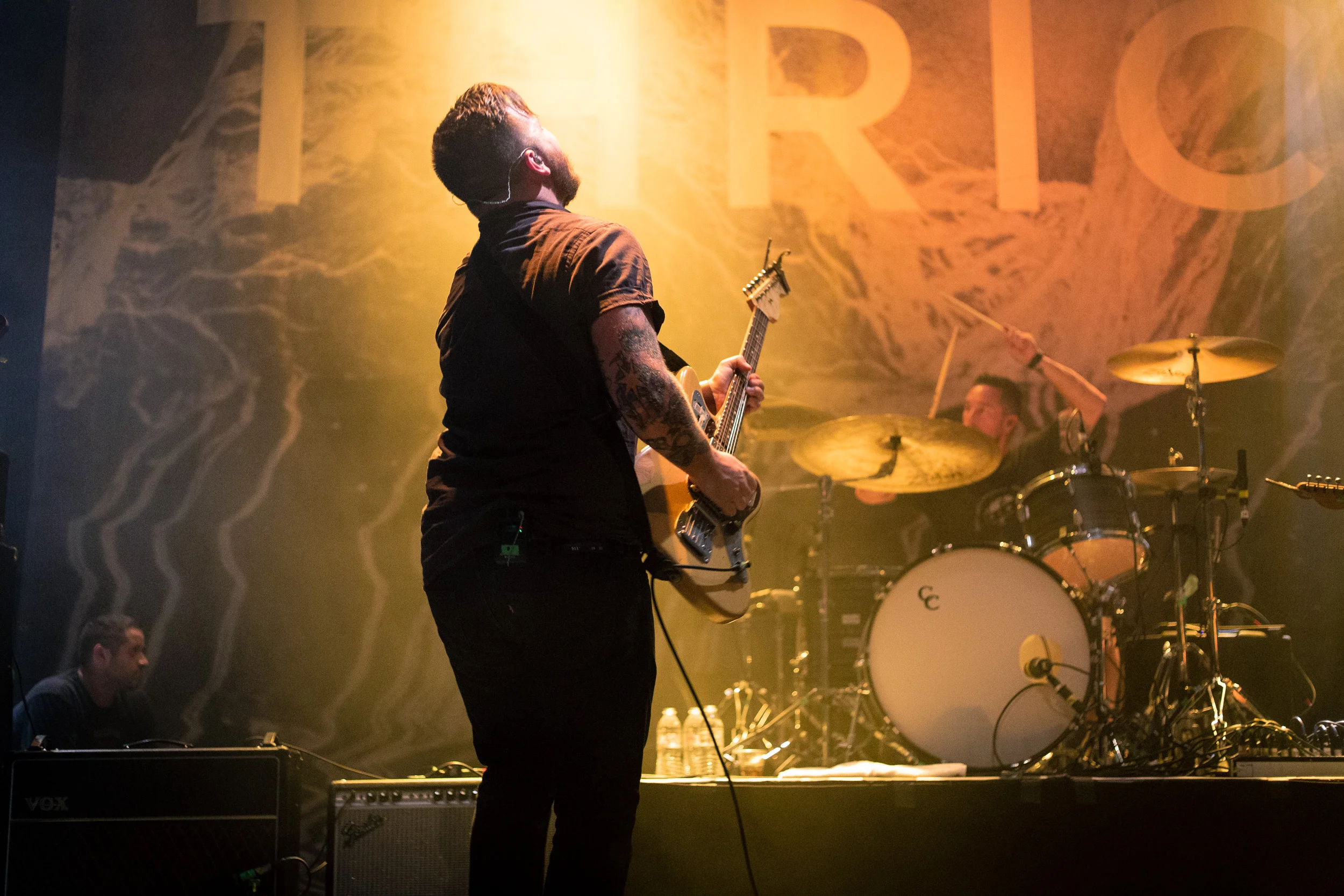
Part of the reasoning for that is this: drummers make big movements, but it's hard to catch the peak of these movements in a photograph. When you do, I think it's essential to try and use the image to communicate the sense of weight and power behind their movements. In this image, Riley's arms are raised, ready to come crashing down, and nothing adds weight to a photo more than sucking the light and space out of it. Which is what I did by darkening it and warming up the colours.
The sense of movement in Dustin as well helps enhance the impact. In an ideal world, I'd have had a slightly longer focal length and had Riley in focus and Dustin pushed a little out of focus, but you can't win 'em all and I do still really like this image.
Edit 1: ISO 5000 | 50mm | f2.5 | 1/320
Edit 2: ISO 5000 | 50mm | f2.5 | 1/320
This is probably the one image I prefer from my original edit. I don't dislike the black and white but I really like the tones of the first version. I did try another colour version of this, but I couldn't do anything with the colours that I liked more.
The one thing I will say in favour of the new black and white version is that it does draw you much more into the face of Riley. Much like the light in the first image I re-edited for this piece does with Dustin. There's something about black and white that brings people's faces to life. Especially when it comes to music photography.
Think I was wrong about any of these? Tamper with something I shouldn't have? Let me know! You're probably right. But maybe you aren't. Who knows?


